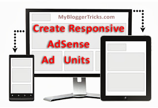
If you have spent any time surfing the internet on your mobile device, looking for information or reading a blog post, you will know how important and satisfying a mobile-optimized website is to a reader. The trend of using mobile devices to connect to the internet has sharply risen, which means webmasters should have websites that cater to the needs of varying screen sizes and varying resolutions. Having a responsive design not only means having a responsive website theme layout, but also having responsive elements, down to the small images and ad units. Speaking of which, Google AdSense has now announced support for responsive ad units, which means that now, you can even change the size of those ad units dynamically depending on the user agent!
Recommended for you: How To Serve Responsive Images On Your Site One of the biggest challenges publishers currently face is designing websites that adapt to different screen sizes, resolutions and user experiences. People have been asking for responsive ad units to help them deliver the best possible user experience on their pages. So the Google AdSense has finally listened to the feedback, and has now made responsive ad units available as a beta feature.
The responsive ad-units use the new asynchronous ad code. This code can be used to set the size of the ad code directly via Cascading Style Sheets (CSS), which allows webmasters to dynamically specify the size of the ad that will be served. Ad sizes previously were fixed, and weren't supposed to be tampered with.
How to create responsive ad units in AdSense?
Step 1: Generating ad code To create a responsive ad-unit, you first have to log into Google AdSense, and create an ad unit, just like you would create an ordinary (non-responsive) ad-unit.
The only difference is, when creating an ad unit, you need to change one option. While creating an ad unit, you will see a drop-down labelled Ad Size. Select the Responsive Ad Unit (BETA) option. Only difference from this and the normal process is, you won't see the Code Type option selector, because Responsive ads already use asynchronous code.
Step 2: Place the ad unit
Now that have the code, this is the easy bit. Simply insert that code into your website source HTML, or in a widget or post/page. You can put this code anywhere you can put the normal non-responsive code.
Step 3: Adjusting the size
Now, you can change the size of the ad-units based on the user agent. This will make use of media queries in CSS to determine the screen size/resolution of the client.
For example, a normal non-responsive ad unit's CSS might look something like this;
.adslot_1 {
width: 320px;
height: 50px;
}
Whereas the CSS for the responsive ad unit would look like this;
.adslot_1 {
width: 320px;
height: 50px;
}
@media (min-width:500px) {
.adslot_1 {
width: 468px;
height: 60px;
}
}
@media (min-width:800px) {
.adslot_1 {
width: 728px;
height: 90px;
}
}
Note how @media queries are used to detect the screen-size/resolution of the client.
Things to remember
- While changing the size of the ad-units using CSS, make sure the dimensions you enter match Google AdSense's supported ad sizes
- Media queries might not work for older browsers, so always set a default size
- These new ad units are responsive on the initial load only. Subsequent changes to screen orientation and screen resolution will not effect these ad units. But Google is working to improve on this, and make it fully responsive
Have you tried out the responsive ad units yet? What are you waiting for? Try them out now, and tell us what you think about them. And leave your responses/opinions in the comments section below. Cheers :)
Filed Under: Google AdSense, How To Source : mybloggertricks[dot]com
No comments:
Post a Comment