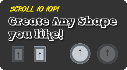
These days since I am on vocations I am trying to improve skills of both Jquery and CSS3. From the combination of beautiful web tricks that I learnt so far, I managed to design a simple scroll to top button that uses JQuery's scrollTop function to produce smooth scrolling and is spiced up with CSS3 effects to make it stand out. I have created just two sample versions with circular and rectangular shapes. The Styles are extremely easy to be customized. Lets first see a demo for the circular one:
Don't forget to check our previously released versions of back to top buttons:
How to add it to Blogger?
- Go To Blogger > Template
- Back up your template
- Click Edit HTML
- Search for <head>
- Just below it paste the following scripts:
<script src='http://ajax.googleapis.com/ajax/libs/jquery/1/jquery.min.js' type='text/javascript'/>
<script src='http://downloads.mybloggertricks.com/scrolltop.js' type='text/javascript'/>
Note: I have included the dynamic link for jquery so you wont need to update it when a new version of Jquery is released. It will update automatically.
6. Now Search for ]]></b:skin>
7. Just above it paste one of the following styles
For circular one use this code:
/* ----- MBT's Back-To-Top Button Circular version -----*/
@-webkit-keyframes arrow_to_top{
0%{
top:10px
}
50%{
top:5px
}
100%{
top:10px
}
}
@-moz-keyframes arrow_to_top{
0%{
top:10px
}
50%{
top:5px
}
100%{
top:10px
}}
@keyframes arrow_to_top{
0%{
top:10px
}
50%{
top:5px
}
100%{
top:10px
}}
#back-top, #back-top:hover{
position: fixed;
display:block;
display:none;
bottom: 20px;
right:20px;
cursor:pointer;
width: 52px;
height:52px;
text-align: center;
text-decoration: none;
color: #797e82;
color: rgba(100,100,100,0.8);
font-size:16px;
border:1px solid #c5ccd3;
border-radius:30px;
z-index:9999;
padding-top:35px;
-webkit-box-sizing: border-box;
-moz-box-sizing: border-box;
box-sizing: border-box;
background: #dee1e7;
background: rgba(208,215,222,0.5);
}
#back-top:hover{
color:#000;
text-shadow:1px 1px 0 #fff;
background: #d0d7de;
background: rgba(208,215,222,0.9);
border-color:#8fa8c1;
}
#back-top:before{
display:block;
content:"";
position:absolute;
z-index:998;
background: #e2e3e6;
background: rgba(222,225,231,0.3);
width: 66px;
height:66px;
border-radius:35px;
border:1px solid #c5ccd3;
top:-9px;
left:-9px
}
#back-top:hover:before{
border-color:#8fa8c1
}
#back-top:after{
display:block;
content:"";
position:absolute;
z-index:10000;
background: url(https://blogger.googleusercontent.com/img/b/R29vZ2xl/AVvXsEjT_kF6ewQRCplOqqtYbqOQkhsi8qEfUuGHJA2jS6limEdmqynFy_ZwAwBlJTjgu_uaVPH1dou3F9yZP6KAZ3I2fDclEyME_Z2B2RhBga8ykRjVCxB5XfzZ8yspJ0vYM7iB7Sd9UmlgVaIr/s400/sprite-mbt.png) -10px -5px no-repeat;
opacity:0.5;
width: 10px;
height:23px;
top:10px;
left:50%;
margin-left:-5px;
}#back-top, #back-top:after, #back-top:before{
-webkit-transition: 0.5s;
-moz-transition: 0.5s;
-o-transition: 0.5s;
-ms-transition: 0.5s;
transition: 0.5s;
}
#back-top:hover:after{
opacity:1;-moz-animation-duration: .5s;
-moz-animation-iteration-count: infinite;
-moz-animation-name: arrow_to_top;
-moz-animation-timing-function: linear;-webkit-animation-duration: .5s;
-webkit-animation-iteration-count: infinite;
-webkit-animation-name: arrow_to_top;
-webkit-animation-timing-function: linear;animation-duration: .5s;
animation-iteration-count: infinite;
animation-name: arrow_to_top;
animation-timing-function: linear;
}
For Rectangular one use this code:
/* ----- MBT's Back-To-Top Button Rectangular version -----*/@-webkit-keyframes arrow_to_top{
0%{
top:10px
}
50%{
top:5px
}
100%{
top:10px
}
}
@-moz-keyframes arrow_to_top{
0%{
top:10px
}
50%{
top:5px
}
100%{
top:10px
}}
@keyframes arrow_to_top{
0%{
top:10px
}
50%{
top:5px
}
100%{
top:10px
}}
#back-top, #back-top:hover{
position: fixed;
display:block;
display:none;
bottom: 20px;
right:0px;
cursor:pointer;
width: 24px;
height:34px;
text-align: center;
text-decoration: none;
color: #797e82;
color: rgba(100,100,100,0.8);
font-size:16px;
border:1px solid #c5ccd3;
border-radius:2px;
z-index:9999;
padding-top:35px;
-webkit-box-sizing: border-box; /* Safari/Chrome, other WebKit */
-moz-box-sizing: border-box; /* Firefox, other Gecko */
box-sizing: border-box; /* Opera/IE 8+ */
margin:0px;
background: #dee1e7;
background: rgba(208,215,222,0.5);
}
#back-top:hover{
color:#000;
text-shadow:1px 1px 0 #fff;
background: #d0d7de;
background: rgba(208,215,222,0.9);
border-color:#8fa8c1;
}
#back-top:before{
display:block;
content:"";
position:absolute;
z-index:998;
background: #e2e3e6;
background: rgba(222,225,231,0.3);
width: 37px;
height:50px;
border-radius:2px;
border:1px solid #c5ccd3;
top:-9px;
left:-9px
}
#back-top:hover:before{
border-color:#8fa8c1
}
#back-top:after{
display:block;
content:"";
position:absolute;
z-index:10000;
background: url(https://blogger.googleusercontent.com/img/b/R29vZ2xl/AVvXsEjT_kF6ewQRCplOqqtYbqOQkhsi8qEfUuGHJA2jS6limEdmqynFy_ZwAwBlJTjgu_uaVPH1dou3F9yZP6KAZ3I2fDclEyME_Z2B2RhBga8ykRjVCxB5XfzZ8yspJ0vYM7iB7Sd9UmlgVaIr/s400/sprite-mbt.png) -10px -5px no-repeat;
opacity:0.5;
width: 10px;
height:23px;
top:7px;
left:50%;
margin-left:-5px;
}#back-top, #back-top:after, #back-top:before{
-webkit-transition: 0.5s;
-moz-transition: 0.5s;
-o-transition: 0.5s;
-ms-transition: 0.5s;
transition: 0.5s;
}
#back-top:hover:after{
opacity:1;-moz-animation-duration: .5s;
-moz-animation-iteration-count: infinite;
-moz-animation-name: arrow_to_top;
-moz-animation-timing-function: linear;-webkit-animation-duration: .5s;
-webkit-animation-iteration-count: infinite;
-webkit-animation-name: arrow_to_top;
-webkit-animation-timing-function: linear;animation-duration: .5s;
animation-iteration-count: infinite;
animation-name: arrow_to_top;
animation-timing-function: linear;
}
8. Now just one last step. Paste the following HTML code just below <body>
<a href='#top' style='right:0px; display: inline;'/>
Tip: Play with border-radius property to design more creative shapes yourself!
9. Save your template and you are all done!
Visit your blog and scroll to bottom to see it working just fine!
How it works?
The script shows and hides the button based on the position of the window. As soon as the user scrolls down, the script will activate the button through .show() function and as soon as the user moves up, the button disappears due to activation of .Hide() function. The soft fading effect also depends on the inner width of the window (i.e 1600px and 812px) and button location. The effects are introduced using simple Jquery built-in functions of fadeIn() and fadeOut().
The button will display to the bottom right corner of the page.
The opacity in button's background colors is introduced using rgba colors. Where thanks to the alpha channel the opacity of the object is easily controlled without introducing a separate property for it. In order to avoid IE's opacity issues I have included a separate property for background color using rgb settings. So the button would look the same in all browsers. However since IE does not support Keyframes animation, therefore the arrow wont animate in IE alone.
Questions?
I just hope this little object may help in adding a new spice to your blog's appearance. If you have any problems installing the widget, just post me a query. If you carefully observe the stylesheet & the scrolltop.js script for this widget, you will be able to learn almost everything about CSS3 and JQuery's widely used functions. Wish you great health and peace buddies. Peace and blessings. :)
Don't forget to check this beautiful image effects using CSS:
Source : mybloggertricks[dot]com
No comments:
Post a Comment